A Heat Map widget is a combination of colored rectangles. Each represents an attribute element. A Heat Map widget allows you to quickly grasp the state and impact of a large number of variables at one time. Heat Maps are often used in the financial services industry to review the status of a portfolio.
The rectangles contain a wide variety and many shadings of colors, which emphasize the weight of the various components. In a Heat Map widget:
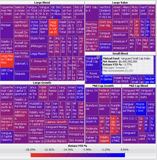
The size of each rectangle represents its relative weight.
The color of each rectangle represents its relative value. For example, in the image below, larger values are blue and smaller values are red.
The large areas, such as the Large Blend area of rectangles in the image below, represent different groups of data.
The small rectangles, such as Sequoia in the image below, represent individual attribute elements.
Note: Some of the rectangles in the Heat Map widget above are hidden from view.
In the image above:
The large areas (such as the Large Blend area in the image above) represent different categories of mutual funds. These areas are generated by the first attribute on the rows of the Grid/Graph that contains the widget. In this case, the first attribute is Mutual Fund Category. Notice that the name of each category is displayed in the headers of each of these areas. You can change the aggregation function used to calculate the size of these areas. For steps, see Formatting a Heat Map widget. This aggregation function is also displayed in a tooltip when the cursor hovers over an area.
The colored rectangles (colored shades of red and blue in the image above) represent different mutual funds. These rectangles, such as the Vanguard Small Cap Index and Legg Mason Value Prim rectangles above, are generated by any additional attributes on the rows. In this case, a second attribute, Mutual Fund, is on the rows of the Grid/Graph.
The size of each rectangle represents its relative weight. This is determined by the first metric on the columns of the Grid/Graph. This widget shows that Large Blend funds are weighted more heavily than Mid-Cap Blend funds in regard to net assets. In this case, the first metric on the columns of the Grid/Graph is Net Assets.
The colors displayed in the widget represent different ranges of return year-to-date percentages generated by the mutual funds. (In the image above, blue denotes higher percentages, while red and purple denote lower percentages.) The colors applied to each rectangle are generated by the second metric on the Grid/Graph. (In the image above, the second metric on the report is Return YTD %.) You can define the colors used to denote these values. For steps, see Analyzing data in a Heat Map widget.
You can display the Heat Map widget as a widget in MicroStrategy Web, or on an iPad with MicroStrategy Mobile. For general information on iPhone and iPad widgets, see About iPhone and iPad widgets.
To successfully analyze a Heat Map widget with large datasets, Flash player version 10 or later must be installed on your computer.
Open the document in Design or Editable mode.
From the Insert menu, point to Widgets, then Flash. Select Heat Map.
Click the location on your document, except for the Detail section, where you want to place the widget. The Grid/Graph, which appears similar to a standard grid container, is displayed. A small icon at the bottom right corner of the Grid/Graph identifies the type of widget that you have added to the document.
If desired, resize the widget by clicking and dragging its handles.
Add objects to the Grid/Graph that contains the widget. To do this, from the Dataset Objects panel on the left, select attributes and metrics and drag them on top of the widget, using the following requirements:
Place at least one attribute on the rows.
Place
a second attribute to the left of the first to group each element of the
first attribute in a larger area. For example, the Region attribute contains
the element South and the Call Center attribute contains the elements
New Orleans and Memphis. If Region is placed to the left of Call Center,
an area called South is displayed in the widget, with the rectangles New
Orleans and Memphis inside. You can add additional attributes to further
group the rectangles in the Heat Map.
You can also create a dynamic Heat Map which uses a selector.
For specific requirements, see
Creating
a dynamic Heat Map.
Place at least two metrics on the columns. If more than two metrics are placed on the Grid/Graph, the additional metrics are ignored.
The first metric on the columns determines the size of each rectangle.
The second metric on the columns is used to provide different shadings of color in the Heat Map widget.
To enable a legend for the widget, right-click the widget and select Properties. On the Display tab, select the Show Legend check box and click OK. A legend is displayed near the widget.
View and test your results in one of two ways:
Select Flash Mode from the Home menu.
If Flash Mode is not available in the Home menu, you must make Flash Mode available in the document. For steps, see Defining which display modes are available to users.
Select Interactive Mode from the Home menu.
The widget must be enabled to be displayed in non-Flash modes to be viewable in Interactive Mode. For instructions to allow a widget to be displayed in non-Flash modes, see Determining how a widget is rendered in non-Flash modes.
Related topics