A Gauge widget is a simple status indicator that displays a needle that moves within a range of numbers displayed on its outside edges. An example of a gauge is a car's speedometer. Like the Cylinder and Thermometer widgets, this type of widget is designed to display the value of a single metric. The needle within the gauge is a visual representation of that single metric value.
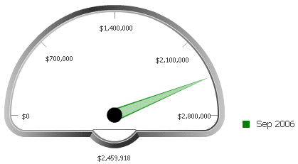
The Gauge widget is most useful when combined with a selector because this allows users to choose specific metric values to display in the gauge. In the image below, the location of the needle in the gauge represents revenue in millions (the Revenue metric).
Open the document in Design or Editable mode.
From the Insert menu, point to Widgets, then Flash. Select Gauge.
Click the location on your document, except for the Detail section, where you want to place the widget. The Grid/Graph, which appears similar to a standard grid container, is displayed. A small icon at the bottom right corner of the Grid/Graph identifies the type of widget that you have added to the document.
If desired, resize the widget by clicking and dragging its handles.
Add objects to the Grid/Graph that contains the widget. To do this, from the Dataset Objects panel on the left, select attributes and metrics and drag them on top of the widget. Place at least one metric on the columns. The metric values determine the location of the needle on the gauge.
To allow users to change the metric value displayed in the widget with a selector:
Insert a selector next to the Gauge widget, then select an attribute as its source. Users choose attribute elements from this selector to change the display in the Gauge widget. For steps to insert a selector and select a source for it, see Inserting a selector into a document.
Set the Gauge widget as the target of the selector. For steps to select an object as the target of a selector, see Choosing targets for a selector.
It is recommended that you also drag the dataset report from the Dataset Objects panel and place it beneath the selector. This allows you to see the report's values as you select different attribute elements from the selector and see how they change the appearance of the Gauge widget.
View and test your results in one of two ways:
Select Flash Mode from the Home menu.
If Flash Mode is not available, you must make Flash Mode available in the document. For steps, see Defining which display modes are available to users.
Select Interactive Mode from the Home menu.
The widget must be enabled to be displayed in non-Flash mode to be viewable in Interactive Mode. For instructions to allow a widget to be displayed in non-Flash mode, see Determining how a widget is rendered in non-Flash modes.
Related topics
Inserting a widget into a document