The Microcharts widget consists of one or more microcharts, which are compact representations of data that allow analysts to quickly visualize trends in data.
Microcharts convey information in such a way that the user can, at a glance, determine the trend of a metric over time or how a metric is performing compared to forecasted figures. The Microcharts widget is useful for this purpose because individual microcharts can display attribute and metric data in a small graph that would otherwise be displayed as a single value in a grid report cell.
The Microcharts widget can be used when an analyst needs to quickly visualize the trend of a metric at a glance without having to know many additional details. The bar, sparkline, and bullet microcharts used in the Microcharts widget convey information that an analyst can understand just by looking at the graph once.
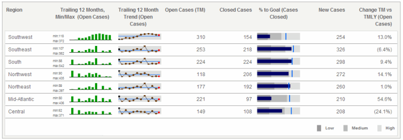
The number of rows in the widget represent the number of elements from the first attribute on the rows of the Grid/Graph that contains the widget. For example, the widget above has seven rows of regional data because the Region attribute on the Grid/Graph's rows has seven different elements, or regions.
Users can view the rows of a Microcharts widget in several ways, known as operation modes. The modes are as follows:
Grid: This is the default operation mode for a Microcharts widget. In this mode, all the rows of microcharts are displayed in a grid layout, as shown above.
Vertical Scroll: In this mode, you can view each row of microcharts as they automatically scroll from the top to the bottom. You can also manually navigate from one row to the next using the Previous and Next buttons on the right side of the widget.
Ticker: In this mode, microcharts and supplemental text are displayed in a scrolling ticker that moves from right to left. You can add text next to each microchart to provide background information or highlight a trend displayed in the microchart. This text is displayed alongside the microcharts as they scroll horizontally.
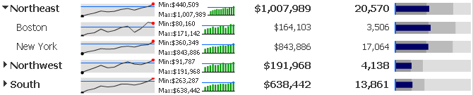
While in Grid mode, if there are three or more attributes on the rows of the Grid/Graph, each attribute except the right-most attribute is combined and displayed as a row in the widget. For example, if Region is the first attribute and Call Center is the second attribute, rows are displayed for Northeast Boston and Northeast New York.
You can enable the widget to group and indent these rows in a hierarchical tree display. The groups can then be collapsed or expanded to show different levels of detail, with each level representing a different attribute. In the image below, rows are grouped by the Region attribute. The Northeast group is expanded to display the elements of the Call Center attribute below, with the rows Boston and New York. You can accommodate up to ten attributes in the tree display. For steps to enable a tree display in the widget, see Formatting a Microcharts widget.
You can display the Microcharts widget as a widget in MicroStrategy Web, or on an iPad with MicroStrategy Mobile (Ticker mode, Vertical Scroll mode, and the tree display are not available on the iPad). Grid Mode and KPI List Mode let you format the Microcharts widget to display only one metric column at a time. When the widget is displayed on an iPad, users can tap the metric column to toggle between different metrics on the columns of the widget's Grid/Graph. For steps to display only a single metric column on the iPad, see Formatting a Microcharts widget. For general information on iPhone and iPad widgets, see About iPhone and iPad widgets.
Open the document in Design or Editable mode.
From the Insert menu, point to Widgets, then Flash. Select Microcharts.
Click the location on your document in which to place the widget. You cannot place the widget in the Detail section of a document.
The Grid/Graph, which looks like a standard grid container, is displayed. A small icon is displayed at the bottom right of the Grid/Graph, identifying the type of widget you added to the document.
If required, resize the widget by clicking and dragging its handles.
To add objects to the Grid/Graph that contains the widget
From the Dataset Objects panel on the left, select attributes, and drag them on top of the widget. The steps below ensure that the widget is prepared to display all three microcharts (bar, sparkline, and bullet); however, this procedure also contains information to display or hide any of the microcharts.
If KPI List mode will not be used, place at least two attributes on the Grid/Graph’s rows.
The elements of the first attribute are displayed as text in the first column of the widget. For example, in the example above, the first attribute is Region and the regions Southwest and Southeast are displayed.
The last (right-most) attribute on the rows determines the X-axis values in the bar microcharts and in the sparkline microcharts in the widget.
If you include additional attributes to the right of the first attribute, they are displayed as additional text columns in the widget. Data for each combination of attribute elements is displayed in the widget. For example, if Region is the first attribute and Call Center is the second attribute, rows are displayed for Northeast Boston and Northeast New York. You can enable the widget to group and indent these rows in a hierarchical tree display. The groups can then be collapsed or expanded to show different levels of detail. For steps, see Formatting a Microcharts widget.
If KPI List mode will be used, place only one attribute on the rows. Use a time-based attribute such as Month since the attribute controls the time series of the bar charts and of the sparklines in the widget. If only one attribute is placed on the rows, KPI List mode is enabled automatically and the widget cannot be used except in KPI List mode.
From the Dataset Objects panel on the left, select metrics, and drag them on top of the widget as follows:
To display all three microcharts, place at least seven metrics on the Grid/Graph’s columns.
The first (left-most) metric on the columns determines the height of the bars in the bar microcharts and the peak points in the sparkline microcharts.
The second metric creates the horizontal reference lines that are displayed in the sparkline microcharts.
The third metric determines the length of the performance measure bar in the bullet microcharts. The bar represents the actual metric value.
The fourth metric determines the maximum possible values in the bullet microcharts.
The fifth metric determines the right-most boundary of the first color band, Band 1, in the bullet microcharts.
The sixth metric determines the right-most boundary of the second color band, Band 2, in the bullet microcharts.
The seventh metric determines the value of the vertical reference line in the bullet microcharts, which is typically the target value for the metric.
Any additional metrics are displayed in the columns of the widget, after the microcharts and their associated metrics.
For KPI List mode, you must place at least one metric on the Grid/Graph's columns.
By default, each metric is calculated and displayed as an individual row in the widget.
To display all three microcharts (bar, sparkline, and bullet), you must place a total of at least seven metrics on the columns as described above. You must also set the number of metrics used to calculate each row in the Metrics per KPI field to seven or greater in the Microchart properties dialog box. For steps, see Formatting a Microcharts widget.
To view and test the widget
View and test your results in one of two ways:
Select Flash Mode from the Home menu.
If Flash Mode is not available, you must make Flash Mode available in the document. For steps, see Defining which display modes are available to users.
Select Interactive Mode from the Home menu.
The widget must be enabled to be displayed in non-Flash modes to be viewable in Interactive Mode. For instructions to allow a widget to be displayed in non-Flash mode, see Determining how a widget is rendered in non-Flash modes.
Related topics