The Microcharts widget consists of compact representations of data that allow analysts to quickly visualize trends in data. Microcharts convey information so that a user can, at a glance, determine the trend of a metric over time or how a metric is performing compared to forecasted figures. The Microcharts widget is useful for this purpose because individual microcharts can display attribute and metric data in a small graph that would otherwise be displayed as a single value in a grid report cell.
Use a Microcharts widget to quickly visualize the trend of a metric at a glance without having to know many additional details. The bar, sparkline, and bullet microcharts used in the Microcharts widget convey information that an analyst can understand just by looking at the graph once.
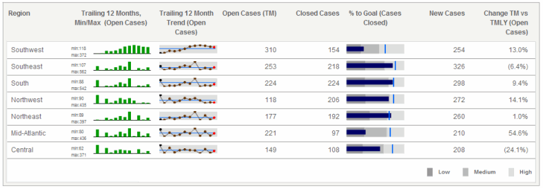
One, two, or three microcharts can be displayed in the Microcharts widget, depending on the number of metrics used on the report in the Grid/Graph. For example, bar and sparkline microcharts are included on the left side of the widget shown below. These microcharts convey the trend of a metric over time, from left to right. On the right side of the widget, bullet microcharts reveal the percentage of cases that were closed, in correlation with the goals for the regions, which are represented by the vertical lines within the bullet microcharts.
When choosing the data to represent on the Microcharts widget, you must designate key performance indicators, or KPIs. KPIs are metrics used to evaluate how a company or business unit within a company reaches a goal. Examples of KPIs are Revenue, Profit, and Employee Headcount.
For KPI List mode, only one attribute can be included on the rows. This attribute should be time-based, since it controls the time series of the bar charts and sparklines in the widget.
Users can view and interact with a Microcharts widget in several ways, known as operation modes. Each of these modes provides the user with a unique way of analyzing the microcharts and data within the widget:
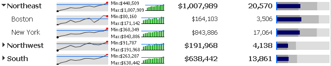
Grid: This is the default operation
mode for a Microcharts widget. In this mode, all the rows of microcharts
are displayed at the same time, from top to bottom, as shown above. Depending
on the number of attributes included in the Grid/Graph, the rows can be
organized into groups in a tree display. Users can click the arrows to
the left of a group to expand or collapse it, as shown below.
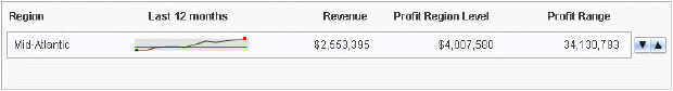
Vertical Scroll: In this mode, you can
view each row of microcharts as they automatically scroll from the top
to the bottom. You can also manually navigate from one row to the next
using the Previous and Next buttons on the right side of the widget, as
shown below:
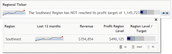
Ticker:
In this mode, microcharts and supplemental text is displayed in a scrolling
ticker that moves from right to left, as shown below. You can add text
next to each microchart to provide background information or highlight
a trend displayed in the microchart. This text is displayed alongside
the microcharts as they scroll horizontally, as shown below:
Related topics