A Data Cloud widget displays attribute elements in various sizes to depict the differences in metric values between the elements. The widget is similar to a heat map since both widgets allow an analyst to quickly identify the most significant, positive, or negative contributions.
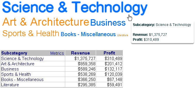
The widget consists of a list of attribute elements. The font size of each attribute element represents a metric value for that element. These metric values represent the values of the first metric on the Grid/Graph. In the widget below, the size of each attribute element from the Subcategory attribute represents the amount of revenue generated by each genre of books.
In the image below, the Grid/Graph is provided below the widget to show the exact metric values for the attribute elements displayed in the widget.
To successfully create a useful widget that can be used to analyze data, you must first correctly define it. After you add a widget to a document, you must place report objects such as attributes and metrics on the Grid/Graph, which resembles a standard grid report. The report objects and their placement on the Grid/Graph determine how the widget displays data in MicroStrategy Web.
Open the document in Design or Editable mode.
From the Insert menu, point to Widgets, then Flash. Select Data Cloud.
Click the location on your document, except for the Detail section, where you want to place the widget. The Grid/Graph, which appears similar to a standard grid container, is displayed. A small icon at the bottom right corner of the Grid/Graph identifies the type of widget that you have added to the document.
If desired, resize the widget by clicking and dragging its handles.
To add objects to the Grid/Graph
From the Dataset Objects panel on the left, select attributes and metrics, and drag them on top of the widget, as described below.
Place at least one attribute on the Grid/Graph's rows.
The elements of the attribute are displayed in the widget. For example, if the attribute is Year, a list of years is displayed in the widget.
If you include additional attributes to the right of the first attribute, elements from all of the attributes are combined and displayed in the widget. For example, if Year is the first attribute and Quarter is the second attribute, every combination of year and quarter is displayed in the widget, including 2007 Q4 and 2007 Q3.
Place at least one metric on the Grid/Graph's columns.
The first metric on the columns determines the size of the font of the attribute elements in the widget.
If you include additional metrics to the right of the first metric, the metrics are displayed in the tooltips. When a user hovers the cursor over an attribute element in MicroStrategy Web, a tooltip is displayed. The tooltip lists the attribute element and metric values for that attribute element.
To enable the widget to be displayed
View and test your results in one of two ways:
Select Flash Mode from the Home menu.
If Flash Mode is not available in the Home menu, you must make Flash Mode available in the document. For steps, see Defining which display modes are available to users.
Select Interactive Mode from the Home menu.
The widget must be enabled to be displayed in non-Flash mode to be viewable in Interactive Mode. For instructions to allow a widget to be displayed in non-Flash mode, see Determining how a widget is rendered in non-Flash modes.
Related topics