A Date Selection widget is a calendar selector that allows you to select which dates you want to see data about in a document or dashboard. You are able to see all of the dates of each month in the widget, which allows you to be able to select dates more easily.
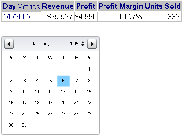
For example, the Date Selection widget is useful if you are working with a dashboard that displays data from Q4 2007 and you want to view data from a month before that. You can select the date you want to see and the data for that date will display on the dashboard, as shown below:
In non-Flash modes in MicroStrategy Web, a Date Selection widget can display as a Grid/Graph (if it was created as a widget) or as a standard selector such as a listbox or button bar (if it was created as a selector).
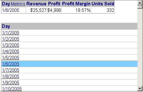
The same dashboard is shown in Interactive Mode in MicroStrategy Web. The Date Selection widget was created using a widget, so the selector is now displayed as a Grid/Graph. (Widgets are created with Grid/Graphs; for general information on widgets, see Providing Flash-based analysis and interactivity: Widgets). Notice the scroll bar at the left: all the dates are not shown in this sample, because the list is too long. Date even further down the list do not appear in the same screen as the graph, which is why the Date Selection widget is so useful.
In non-Flash modes, the widgets can instead be hidden or displayed as an empty Grid/Graph placeholder. For examples, see Defining how a widget is rendered in non-Flash modes.
On an iPad with MicroStrategy Mobile, the widget can display as an interactive event calendar, which users can view in Day, Week, or Month View. For detailed information about the calendar, and steps to create a Date Selection widget for display on the iPad, see Creating a Date Selection widget for display on the iPad.
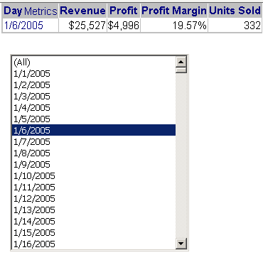
If the Date Selection widget was created as a selector rather than as a widget, in Interactive Mode, the dashboard looks like the sample shown below. You can set the style of the selector, which in this example is left as the default Listbox. Again, all the dates are not shown, because the list is so long. The scrollbar allows you to view and select dates further down the list.
These examples target a Grid/Graph, but a panel stack can also be the target of a Date Selection widget. However, a Date Selection widget created as a widget cannot switch panels on a panel stack.
The table below summarizes the differences between a Date Selection widget created as a widget and as a selector.
|
|
Widget |
Selector |
|
Display in Flash Mode |
Date Selection widget |
Date Selection widget |
|
Display in non-Flash modes |
Can be any of the following:
Note: A Date Selection widget created as a widget can be displayed as a widget using Flash in DHTML interactive documents. |
Selector displayed in the chosen DHTML style |
|
Display on the iPad |
Displayed as an interactive calendar |
Selector displayed in the chosen DHTML style |
|
Target panel stacks and Grid/Graphs |
Yes |
Yes |
|
Multiple selections |
No |
Yes |
|
Target of another selector |
Yes |
Only if the selector is on a panel stack (see Allowing a selector to be updated by other selectors) |
|
Method of creating |
Create a widget |
Create a selector |
For instructions to create a Date Selection widget as a selector, see Creating a Date Selection widget as a selector for display in Web.
Related topics