The Date Selection widget allows users to display an interactive event calendar on an iPad with MicroStrategy Mobile. Users can display a list of events in the calendar by month, week, and day, display events using different colored headers based on the event category they belong to, and search for events using the Search field.
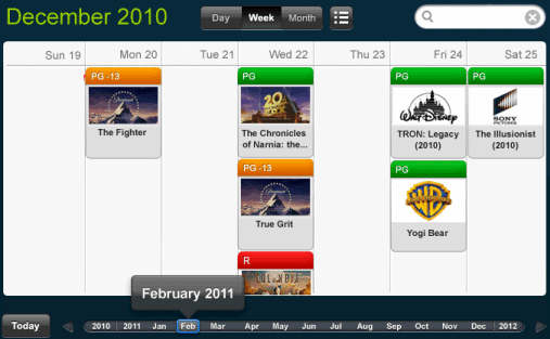
You can display events in the calendar using different colors depending on the event's category. For example, release dates for movies are displayed as events in the calendar, and the movies are divided into categories based on the rating of the movie. You can display movies rated PG in green, movies rated PG-13 in yellow, and movies rated R in red, as shown in the image below.
You can choose to automatically assign a color to the each category, or assign a specific color to each category. For example, if colors are automatically assigned and the movies displayed in the calendar above are filtered to only display movies with an R-rating, R-rated movies may be displayed in green instead of red. Instead, you can define the color to display for each category, to make sure R-rated movies are always displayed in red, PG-13 movies are always displayed in yellow, and so on. For steps to determine how colors are assigned to event categories, see Formatting a Date Selection widget for display on the iPad.
A Date Selection widget displays by default as:
\
an interactive event calendar on the iPad
a Date Selection widget in Flash Mode, Interactive Mode, and Express Mode in MicroStrategy Web
You can change how the widget is displayed on the iPad, and in different display modes when viewed in MicroStrategy Web. For example, you can choose to display the widget as a grid or graph report when viewed on the iPad, or as a placeholder when viewed in Express Mode. For steps, see Determining how a widget is rendered in non-Flash modes.
You can have the widget display additional information about an event in an Information Window when a user taps the event on the iPad. For steps, see To define an Information Window for a Date Selection widget.
This procedure assumes that you have already created the following attributes to add to the widget's Grid/Graph:
The first attribute represents each day displayed in the calendar, and must contain elements of the date data type.
The second attribute provides the events displayed in the calendar, and its attribute forms must adhere to the following:
The first attribute form contains the description of the event.
An image attribute form (optional), which contains the image displayed for the event when the widget is shown in Day View. This attribute form must be of the image data type.
A second image attribute form (optional), which contains the image displayed for the event when the widget is shown in Week View. This attribute form must be of the image data type.
The third attribute (optional) provides the category name displayed for each event in the calendar, and can be used to color the events on the calendar by category. Its attribute forms must adhere to the following:
The first attribute form contains the description of the category. For example, using the example of movies displayed as events above, the category descriptions might be PG, R, and so on.
The last attribute form (optional) contains the color in which to display the category, stored as a hex value (such as #FF0000). For steps to determine the color used to display event categories in the widget, see Formatting a Date Selection widget for display on the iPad.
Additional attributes and metrics are displayed under the description of the event in Day View, or in pop-up tooltips when the user selects an event on the iPad.
Open the document in Design or Editable Mode.
From the Insert menu, point to Widgets, then iPhone/iPad. Select Date Selection.
Click the location on your document where you want to place the widget. If desired, resize the widget's Grid/Graph by clicking and dragging its handles.
From the Dataset Objects panel on the left, select attributes and drag them on top of the widget. Place at least two attributes on the Grid/Graph's rows, as described below.
The first attribute represents each day displayed in the calendar, and must contain elements of the date data type.
The second attribute provides the events displayed in the calendar, and its attribute forms must adhere to the following:
The first attribute form contains the description of the event.
An image attribute form (optional), which contains the image displayed for the event when the widget is shown in Day View. This attribute form must be of the image data type.
A second image attribute form (optional), which contains the image displayed for the event when the widget is shown in Week View. This attribute form must be of the image data type.
The third attribute (optional) provides the category name displayed for each event in the calendar, and can be used to color the events on the calendar by category. Its attribute forms must adhere to the following:
The first attribute form contains the description of the category. For example, using the example of movies displayed as events above, the category descriptions might be PG, R, and so on.
The last attribute form (optional) contains the color in which to display the category, stored as a hex value (such as #FF0000). For steps to determine the color used to display event categories in the widget, see Formatting a Date Selection widget for display on the iPad.
You can choose to display an Information Window when a user taps on an event on the iPad, to provide additional information about the event. Steps to add an Information Window to the widget are below.
This procedure assumes you have already added a Date Selection widget to the document, as described in the steps above.
Open the document in Design or Editable Mode.
From the Insert menu, select Panel Stack.
Click the location on your document where you want to place the panel stack. The panel stack is added to the document.
Add content to the panel stack, such as images and data fields. For more information on adding content to a panel stack, as well as steps to format the panel stack, see Inserting a panel stack into a document.
Right-click the panel stack, then select Properties and Formatting. The Properties and Formatting dialog box is displayed.
From the left, select General.
Select the Use as Information Window check box.
Click OK to return to the document.
Right-click the event attribute on the rows of the widget's Grid/Graph, then select Use as Selector. By default, the selector automatically targets all Grid/Graphs and panel stacks in the same panel or document section as the selector. You can disable automatic target maintenance and choose targets manually. For more information on automatically maintaining selector targets, see Automatically maintaining targets for selectors.
Related topics