A Time Series Slider widget is an area graph that allows a document analyst to choose which section of the graph to view at a time. The widget consists of two related graphs, one positioned above the other. The top graph is the controller, and contains a slider. The bottom graph is the primary graph. You use the slider on the controller to select some portion of the controller, which determines the range of data visible in the primary graph.
Time series datasets are often long and require analysis from both a macro and micro view. Therefore, the time series slider widget requires only one attribute, preferably one with many values. This attribute is normally time-based, but it does not have to be. The widget also requires only one metric. In the graph:
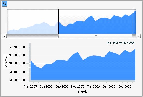
The X-axis represents the attribute. In the image below, this is the Month attribute.
The Y-axis represents the metric. In the image below, this is the Revenue metric.
Note: If you include two metrics on the columns of the Grid/Graph that contains the widget, a line graph is displayed with the area graph.
Open the document in Design or Editable mode.
From the Insert menu, point to Widgets, then Flash. Select Time Series Slider.
Click the location on your document, except for the Detail section, where you want to place the widget. The Grid/Graph, which appears similar to a standard grid container, is displayed. A small icon at the bottom right corner of the Grid/Graph identifies the type of widget that you have added to the document.
If desired, resize the widget by clicking and dragging its handles.
Add objects to the Grid/Graph that contains the widget. To do this, from the Dataset Objects panel on the left, select attributes and metrics and drag them on top of the widget, using the following requirements:
Place at least one attribute on the rows. This attribute is typically time-based, such a Day or Quarter attribute. Its elements are displayed on the X-axis.
Place one metric on the columns. The metric values are displayed on the graph report's Y-axis. If you include two metrics, a line graph and an area graph are displayed together.
You can allow users to change the values displayed in the widget with a selector:
Insert a selector next to the Time Series Slider widget. This selector allows users to choose different attribute elements. Assign an attribute as the selector's source. For steps to insert a selector and choose a source for it, see Inserting a selector into a document.
Set the Time Series Slider Grid/Graph as the target of the selector. For steps to select an object as target of a selector, see Choosing targets for a selector.
It is recommended you also drag the dataset report from the Dataset Objects panel and place it beneath the selector. This allows you to see the report's values as you select different attribute elements from the selector and see how they change the appearance of the Time Series Slider widget.
View and test your results by selecting Flash Mode from the Home menu.
If Flash Mode is not available in the View menu, you must make Flash Mode available in the document. For steps, see Defining which display modes are available to users.
Related topics