The result of a user’s interactive selections can impact multiple objects simultaneously. To make this easier to design, you can use a panel stack, which is a collection of panels. Each panel can contain groups of objects. Panels help you display only those groups of data that should be seen in unison.
Additional features let the user navigate between panels, and quickly change the display of data within a panel. Each is described below.
Layering data in dashboards: Panels and panel stacks: An analyst can flip from panel to panel within a dashboard’s panel stack, displaying exactly the set of information he wants to see grouped together on the screen.
Providing interactivity to users: Selectors: Selectors provide dashboards with interactivity, allowing each user to change how he sees the data.
Adding title bars to identify objects: A title bar is simply an area across the top of a panel stack or Grid/Graph. You can choose whether to display the title bar for each panel stack and Grid/Graph. When it is displayed, the title bar contains a title and several buttons. The buttons allow a user, in MicroStrategy Web, to minimize and maximize the Grid/Graph. For instructions, see Adding title bars to Grid/Graphs and Displaying title bars in panel stacks.
Quick Switch is a button that allows an analyst to quickly change a Grid/Graph from Graph view to Grid view and back, with a single click. Users with access to Desktop are able to activate the Quick Switch and make it available in MicroStrategy Web.
Providing Flash-based analysis and interactivity: Widgets: A widget is a type of MicroStrategy Report Services control that presents data in a visual and interactive way. You can think of widgets as interactive Flash-only graphs that dynamically update when you select a new set of data to view. You can even interact with some types of widgets to manually select a set of data to analyze.
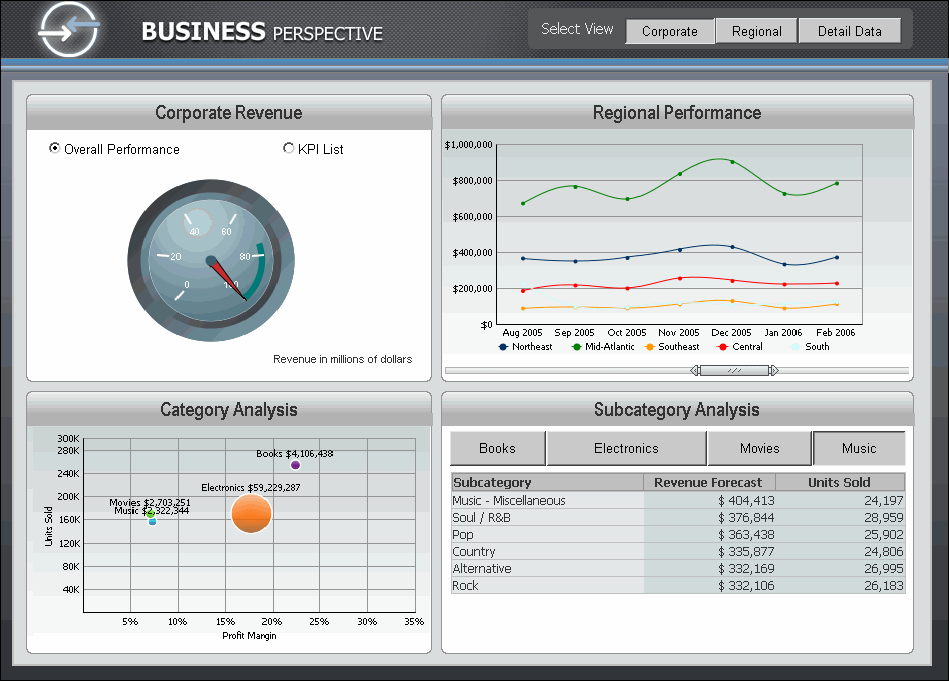
The following image provides an example of a dashboard document and several of the features mentioned above.
Notice the following in the dashboard above:
A Button style selector is used at the top right of the dashboard. This selector allows a user to choose to view either a Corporate, Regional, or Detail Data view. Each of these separate sections of the dashboard is actually a separate panel within a panel stack in the document. For example, within one panel stack, there is a panel for Corporate, a panel for Regional, and another panel for Detail Data. In the image above, the Corporate panel is displayed, but the other two are hidden. This is the main use of panels and panel stacks, as explained in Inserting and defining panels.
A Radio Button style selector is used at the top left of the dashboard. This selector allows a user to choose either Overall Performance or KPI List data.
A Slider style selector is used in the graph at the top right of the dashboard. The Slider selector allows a user to browse data along the X axes, from left to right.
A Button style selector is used at the bottom right of the dashboard. A user can click a button to view that specific data on the grid report.
Related topics