You can display different controls (that is, objects that can be placed on a document, such as Grid/Graphs, text fields, shapes, and so on) in a dashboard or document so that users can navigate them as if they were pages or subsets of the larger document. These pages or layers of data are called panels, and a group of panels is referred to as a panel stack. Panel stacks allow a designer to create several different views (panels) of data, with each view (panel) containing a logical grouping of controls that display data that is related in a meaningful way.
Panels are essential building blocks for interactive dashboards, which summarize key business indicators in easy-to-read interfaces.
Use panel stacks to provide interactive data layering. You can create:
Stacks of analytic layers on a single dashboard page
Multiple layers of dashboards
For examples and images of these types of dashboards, see the MicroStrategy Report Services Document Creation Guide.
Selectors allow a user to display different metrics or different elements of attributes, custom groups, or consolidations in a Grid/Graph (the target of the selector). Targets can be automatically maintained in a layout. This means that when you add a Grid/Graph, the Grid/Graph is the target of all selectors in the same panel or document section as the Grid/Graph. For more information about automatically maintaining targets for selectors, including instructions to enable and disable the functionality, see Automatically maintaining targets for selectors.
Note: Selectors can also allow a user to flip through the panels in a panel stack. Targets are not automatically maintained for this type of selector; you always manually define the targets for panel selectors.
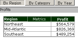
The image below shows an example of a panel stack during the design process (in Editable Mode). The current panel contains a gauge graph report. The panel consists of the report itself, a title bar, and a text field at the bottom that displays the total Revenue.
Since the panel stack is in Editable Mode, a floating toolbar is displayed above the panel. From the toolbar, a document designer can move the entire panel stack, switch from one panel to the next to format or add objects, create new panels, delete panels, and re-order the panels. For information about the floating toolbar, see Accessing the Panel Stack floating toolbar.
The Button style selector above the panel lets analysts determine which panel is displayed in the document.
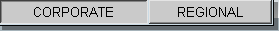
When an analyst clicks the Corporate button, the first panel (shown above) is displayed. When an analyst clicks the Regional button, the second panel in the panel stack is displayed, showing a more regional view of revenue data. For steps to add a selector for a panel stack, see Creating a selector for a panel stack.
The panel stack is the holder for a group of panels. You must add a panel stack before you can insert more panels (a new panel stack already contains one panel). The panels contain the controls (Grid/Graphs, text fields, and so on) that display the data, such as metrics and graphs, that a user sees.
The border of the panel stack is visible to the user. The border properties include 3D borders, drop shadows, and rounded corners (displayed in Flash Mode only), as well as standard border options such as color and style. The background color comes from the individual panel; you can format each panel to have a different background color.
Most of the properties that control a group of panels are set in the panel stack. These properties include whether a title bar or pop-up text is displayed, as well as size and position information.
The title bar, when displayed, is an area across the top of the panels that shows the title. You can choose whether the title bar displays the name of the panel stack or of the panel currently being displayed.
The current panel is the panel currently displayed in Design Mode. This panel is displayed on the panel stack when the document is viewed by the analyst.
Add a selector, such as a radio button or pull-down list, to allow users to display the different panels of a panel stack. You can also allow users to change the panel displayed in the panel stack by using icons in the panel stack's title bar. For steps and an example image, see Enabling panel selector arrows on a panel stack.
A selector is not part of a panel stack, unlike the other items described above. A selector is a different type of control and is added to the document separately. The title bar, for instance, is an area of the panel stack, and each panel is contained in the panel stack. However, a selector is an important and necessary addition to a panel stack because a selector allows the user to switch panels.
Related topics