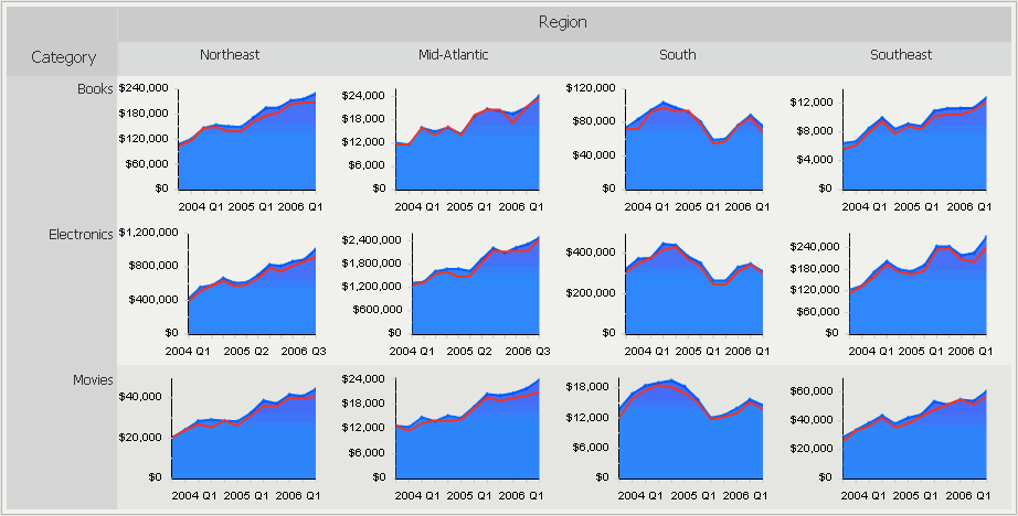
The Graph Matrix widget consists of several area graphs that display actual values. Each area graph also has a line graph above it to show forecasted values. One graph is displayed for every combination of elements from the attributes in the Grid/Graph’s rows and columns. For example, in the widget below, the Category attribute is in the Grid/Graph’s rows and the Region attribute is in the Grid/Graph’s columns. Twelve graphs are displayed because data exists for four regions and three categories of products.
There is a separate area graph for each combination of region and product category. For example, there is an area graph that focuses solely on electronics product figures in the Northeast region. Values in that graph are plotted across quarter (on the X-axis) and revenue (on the Y-axis). The line graph at the top of the area graph represents revenue forecast metric values, or the amount of revenue the company predicted it would generate.
Open the document in Design or Editable mode.
From the Insert menu, point to Widgets, then Flash. Select Graph Matrix (deprecated).
Click the location on your document in which to place the widget. You cannot place the widget in the Detail section of a document. The Grid/Graph, which appears similar to a standard grid container, is displayed. A small icon at the bottom right corner of the Grid/Graph identifies the type of widget you have added to the document.
If required, resize the widget by clicking and dragging its handles.
To add objects to the Grid/Graph that contains the widget
From the Dataset Objects panel on the left, select attributes and metrics, and drag them on top of the widget, as described below.
You must place either two attributes on the rows, one attribute on the columns, and one metric on the columns, or you must place three attributes on the rows and one metric on the columns.
Place at least two attributes on the Grid/Graph's rows.
The first (left-most) attribute on the rows, and the second, third, fourth, and so on, provide the row headers in the widget.
The last (right-most) attribute on the rows provides the X-axes of the graphs. This attribute, which is generally time-based, is used to drive the time series of the graphs.
If there are only two attributes on the Grid/Graph's rows, place at least one attribute on the columns. Additional attributes on the columns produce separate line graphs within each area graph in the widget.
Place at least one metric on the Grid/Graph's columns. The value of this metric is graphed on the y-axis.
The first metric on the columns is depicted as the colored series in the area graphs.
Any additional metrics are depicted as the forecast lines in each area graph.
To display and test the widget
View and test your results in one of two ways:
Select Flash Mode from the Home menu.
If Flash Mode is not available, you must make Flash Mode available in the document. For steps, see Defining which display modes are available to users.
Select Interactive Mode from the Home menu.
The widget must be enabled to be displayed in non-Flash mode to be viewable in Interactive Mode. For instructions to allow a widget to be displayed in non-Flash mode, see Determining how a widget is rendered in non-Flash modes.
Related topics