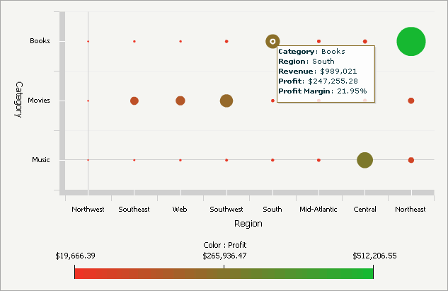
The Bubble Grid widget conveys information in such a way that an analyst can, at a glance, identify important trends or anomalies in data, relative to the total contribution of accompanying data. In the widget, metric values are plotted as bubbles of different colors and sizes; the colors and sizes of the bubbles represent the values of two distinct metrics on the Grid/Graph. Each bubble is generated at the intersection of two different attribute elements. For example, in the widget below, a single bubble depicts the profit and revenue for books (an element of the Category attribute) in the South region (an element of the Region attribute).
The Bubble Grid widget is most beneficial when it is used to perform analyses involving key business ratios, such as the number of customers in a store vs. the revenue generated per customer.
To successfully create a widget that can be used to analyze data, you must place report objects such as attributes and metrics on the Grid/Graph, which resembles a standard grid template. The report objects and their placement on the Grid/Graph determine how the widget displays data in MicroStrategy Web.
Open the document in Design or Editable mode.
From the Insert menu, point to Widgets, then Flash. Select Bubble Grid.
Click the location on your document, except for the Detail section, where you want to place the widget. The Grid/Graph, which appears similar to a standard grid container, is displayed. A small icon at the bottom right corner of the Grid/Graph identifies the type of widget you have added to the document.
If desired, resize the widget by clicking and dragging its handles.
To add objects to the Grid/Graph that contains the widget
From the Dataset Objects panel on the left, select attributes and metrics, and drag them on top of the widget, as described below.
Place
two attributes on the Grid/Graph's rows.
Note: Bubbles are generated at the intersections of the
elements from these attributes.
Elements from the first (left-most) attribute are displayed on the X-axis of the widget. This attribute represents one of the business areas that can be analyzed in the widget.
To analyze data along the X-axis relative to time, use a time-based attribute such as Hour, Day, or Month. If you use an Hour or Day attribute, apply a view filter to the Grid/Graph to limit the amount of hours or days displayed at the same time in the widget. For more information about View filters, see Creating, editing, and deleting view filters in Grid/Graphs in documents.
Elements from the second attribute are displayed on the Y-axis of the widget. This attribute represents the other business area that can be analyzed in the widget.
Place at least two metrics on the Grid/Graph's columns. The values of these two metrics produce the bubbles in the widget, as described below:
The first (left-most) metric determines the size of the bubbles. The smallest metric values produce the smallest bubbles in the widget; the largest metric values produce the largest bubbles.
The second metric determines the color of the bubbles. For example, if Profit is the second metric on the columns, the colors of the bubbles depict the range of profit values. You can determine which colors are used for minimum and maximum metric values. This range of colors is depicted in the legend at the bottom of the widget, if the legend is enabled.
Additional metrics are displayed in tooltips when an analyst hovers the cursor over a bubble in MicroStrategy Web. These metrics do not have an effect on the size or color of the bubbles in the widget.
To enable the widget to be displayed
View and test your results in one of two ways:
Select Flash Mode from the Home menu.
If Flash Mode is not available in the Home menu, you must make Flash Mode available in the document. For steps, see Defining which display modes are available to users.
Select Interactive Mode from the Home menu.
The widget must be enabled to be displayed in non-Flash mode to be viewable in Interactive Mode. For instructions to allow a widget to be displayed in non-Flash mode, see Determining how a widget is rendered in non-Flash modes.
Related topics
Inserting a widget into a document