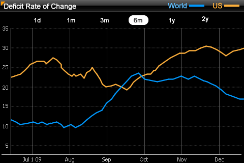
The Time Series widget allows you to display data over a specific period of time. The widget is displayed as a line graph on an iPhone or iPad with MicroStrategy Mobile. You can configure the widget to display multiple data series on the same graph. For example, the values of the Deficit Rate of Change metric for the US and world over a six month period are displayed in the image below.
You can configure the Time Series widget to provide data across multiple time intervals. For example, in the image above, data is displayed for a six-month time period. However, the widget can also display data for one day, one month, or several years. You can add intervals to a widget by configuring the widget's properties, as described in the steps below.
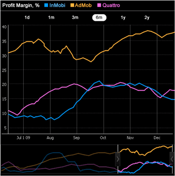
On the iPad, a slider is displayed below the primary graph, as shown in the image below. You can drag the slider to select a range of the data to display on the primary graph. You can drag the edges of the slider to increase or decrease the amount of data displayed at one time.
A Time Series widget displays as a:
widget, grid report, or graph report on the iPhone or iPad
grid or graph report in Flash Mode in MicroStrategy Web
grid or graph report or a placeholder, or can be hidden, in Interactive mode and Express mode (DHTML) in MicroStrategy Web, PDF View in Desktop, and when exported to PDF or Excel. For more information on the alternative display setting, see Determining how a widget is rendered in non-Flash modes.
You can display a report as a Time Series widget, or add a Time Series widget to a document. The widget is then displayed when the report or document is viewed on an iPhone with MicroStrategy Mobile. On the iPad, you can display a Time Series widget that has been added to a document.
The number of data points displayed in a Time Series widget is determined by the maximum number of rows displayed in the grid on which it is based. For steps to change the number of data points displayed for:
a report displayed as a Time Series widget, see To determine the maximum number of data points displayed in a report.
a Time Series widget in a document, see To determine the maximum number of data points displayed in a document.
Note: Increasing the number of rows that can be displayed in a grid report may impact performance when the report or document is displayed.
The following procedures provide separate steps to add a Time Series widget to a document, or display a report as a Time Series widget.
Open the document in Design or Editable mode.
From the Insert menu, point to Widgets, then iPhone/iPad. Select Time Series.
Click the location on your document, except for the Detail section, where you want to place the widget. The Grid/Graph is displayed. A small icon at the bottom right corner of the Grid/Graph identifies the type of widget you have added to the document.
If desired, resize the Grid/Graph by clicking and dragging its handles.
From the Dataset Objects panel on the left, select attributes and metrics, and drag them on top of the widget, as described below:
Place at least one attribute on the Grid/Graph's rows. The attribute provides the values along the horizontal axis of the widget and should be time-based. The last (right-most) attribute on the rows determines the granularity, or level at which users can view data in the widget. For example, if the granularity is set to the Day level, users can view data in the widget for each individual day.
Place at least one metric on the Grid/Graph's columns. The values of this metric are graphed in the widget.
To view data for multiple series, place at least one attribute on the Grid/Graph's columns. The elements of the attribute are each graphed on the widget's axis.
Configure the widget's display properties
Right-click the widget, then select Properties and Formatting. The Properties and Formatting dialog box opens.
From the left, select Widget.
Click the Widget
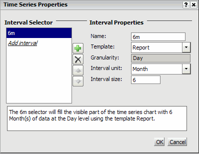
Properties icon  . The Time Series Properties dialog box opens.
Interval selectors let users select the time period for which they want to view data in the widget, allowing users to examine the data at different levels of detail. You can add, rearrange, or delete interval selectors in a Time Series widget:
To add a new interval selector to the widget:
Click Add. The new selector is added and displayed.
Type a name for the selector in the Name field.
From the Template drop-down list, select the Grid/Graph in the document that contains the time-based attribute you want to use to create the interval selector. The granularity is automatically determined by the last (right-most) attribute on the Grid/Graph's rows, as described above.
From the Interval unit drop-down list, select the units in which you want to specify the length of the time interval. In the image above, a six-month interval is defined, and Month is selected as the interval unit.
Type the number of units you want to include in the interval in the Interval size field. For example, if the Interval unit is defined as Month, you can type 6 to specify a six-month time interval, as shown in the image above.
A summary of the interval selector's properties is displayed in the bottom pane. Repeat the appropriate steps above to add additional interval selectors.
To rearrange the order in which an interval selector is displayed, click Move up or Move down to change the position of the selector.
To delete an interval selector, select its name in the Interval Selector list to the left, then click Remove. The interval selector is removed.
Click OK to return to the Properties and Formatting dialog box.
Click OK again to save changes.
Open the document containing the widget in Design or Editable mode.
Right-click the widget's Grid/Graph and select Properties and Formatting. The Properties and Formatting dialog box opens.
From the left, select Advanced.
Select the Enable incremental fetch in Grid check box.
Type the maximum number of data points
you want to display in the widget in the Maximum
number of rows per page field.
Note: Increasing the number of rows that can be displayed in
a grid may impact performance when the report or document is displayed.
Click OK to save changes.
The Custom Visualizations Editor must be enabled. For more information to enable the Custom Visualizations Editor, see the Web Administrator Help.
This procedure assumes you have already created a report with the following requirements:
Place at least one attribute on the Grid/Graph's rows. The attribute provides the values along the horizontal axis of the widget and should be time-based. The last (right-most) attribute on the rows determines the granularity, or level at which users can view data in the widget. For example, if the granularity is set to the Day level, users can view data in the widget for each individual day.
Place at least one metric on the Grid/Graph's columns. The values of this metric are graphed in the widget.
To view data for multiple series, place at least one attribute on the grid's columns. The elements of the attribute are each graphed on the widget's axis.
Click the name of the report to run it.
From the Tools menu, select Custom Visualizations. The Custom Visualizations Editor opens.
To display the report as a Time Series widget on the iPhone, from the iPhone drop-down list, select Time Series.
Click the Widget
Properties icon . The Time Series Properties dialog box opens.
Interval selectors let users select the time period for which they want to view data in the widget, allowing users to examine the data at different levels of detail. You can add, rearrange, or delete interval selectors in a Time Series widget:
To add a new interval selector to the widget:
Click Add. The new selector is added and displayed.
Type a name for the selector in the Name field.
From the Template drop-down list, select the Grid/Graph in the document that contains the time-based attribute you want to use to create the interval selector. The granularity is automatically determined by the last (right-most) attribute on the Grid/Graph's rows, as described above.
From the Interval unit drop-down list, select the units in which you want to specify the length of the time interval. In the image above, a six-month interval is defined, and Month is selected as the interval unit.
Type the number of units you want to include in the interval in the Interval size field. For example, if the Interval unit is defined as Month, you can type 6 to specify a six-month time interval, as shown in the image above.
A summary of the interval selector's properties is displayed in the bottom pane. Repeat the appropriate steps above to add additional interval selectors.
To rearrange the order in which an interval selector is displayed, click Move up or Move down to change the position of the selector.
To delete an interval selector, select its name in the Interval Selector list to the left, then click Remove. The interval selector is removed.
Click OK to return to the Custom Visualizations Editor.
Click OK again to save changes.
Select Preferences at the top of any page. The Preferences page opens.
On the left, select Grid display. The Grid display preferences page opens.
Type the maximum number of data points
you want to display in the widget in the Maximum
rows in grid field.
Note: Increasing the number of rows that can be displayed in
a grid may impact performance when the report or document is displayed.
Click Apply to apply changes.
Related topic