A dashboard is a special type of document. A dashboard is commonly only one page long, is intended to be viewed online, and usually provides interactive features that let analysts change how they view the dashboard’s data. By being only one page long, a dashboard makes it easy to view the entire document at once and see all of its information. A dashboard allows interactivity from users, so each user can change how they see the data, within the limits of what the controls allow them.
A dashboard is a display of related sets of data on one screen, and it is commonly used to assess company or personal performance, to take a quick status check of the company, or to monitor personal work or work group contributions to overall goals of the business. Dashboards summarize key business indicators, such as revenue and profit margin, by presenting them in visually intuitive, easy-to-read, interactive documents.
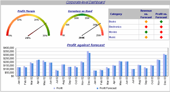
The following dashboard presents several common dashboard qualities:
Common dashboard characteristics in the example shown above include:
The gauge, which shows corporate revenue and profit margin information at a glance.
The graphs, which displays monthly revenue data in an easy-to-understand format.
The tabs at the top right (Corporate, Regional, and Detail Data), which allow a user to view different areas of the business, providing a quick status check across the company. This set of tabs is one of the interactive features of the document.
More generally, a typical dashboard contains the following characteristics:
Only one page, so that it is easy to view the entire document at once and see all the information.
Used online rather than printed out.
Provides interactive functionality so users can change how they see the data. For example, a user can select exactly which data to see by selecting metrics or attribute elements to be displayed in a Grid/Graph.
There is no single feature that you use to design a dashboard; you can choose selectors, widgets, panels, and other controls to create a personalized, custom dashboard that suits your user’s specific needs. Various formatting options such as gradient colors and 3D effects also help you create dashboards with a style appropriate for the boardroom. For examples with images, see the MicroStrategy Report Services Document Creation Guide.
The designer can create more flexible data presentations with dashboards than with documents, since more users can be served with a single dashboard. Each user can interact with the dashboard to display only the subset of data they are interested in (using panels and selectors) or only specific attribute elements or metrics (using a selector).