A Heat Map visualization is a combination of colored rectangles, each representing an attribute element. A Heat Map visualization allows you to quickly grasp the state and impact of a large number of variables at one time. Heat Maps are often used in the financial services industry to review the status of a portfolio.
The rectangles contain a wide variety and many shadings of colors, which emphasize the weight of the various components. In a Heat Map visualization:
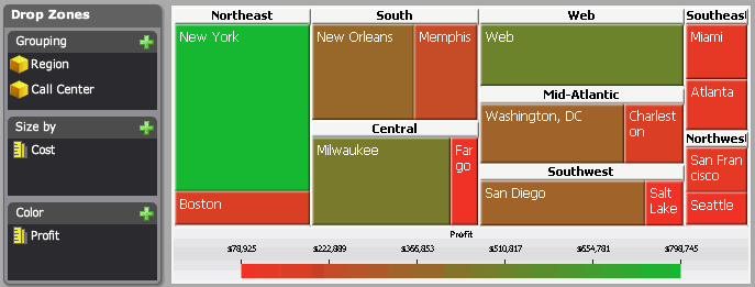
The size of each rectangle represents its relative weight.
The color of each rectangle represents its relative value. For example, in the image below, larger values are green and smaller values are red.
The large areas, such as the Mid-Atlantic area of rectangles in the image below, represent different groups of data.
The small rectangles, such as New York in the image below, represent individual attribute elements.
You must have the Web Visual Insight and Execute Document or Analysis privileges.
Click the name of the analysis to run it.
Click the Add
Visualization icon ![]() , then select Heat
Map.
, then select Heat
Map.
To add data to the visualization,
from the Dataset Objects panel,
click and drag them to the Drop Zones
panel, as follows:
Note: If the Dataset Objects panel is not displayed, click the
Dataset Objects icon in the analysis
toolbar.
Drag
at least one attribute to the Grouping
area. The elements of the attribute are displayed in the visualization.
For example, if the attribute is Year, a rectangle for each year is displayed
in the visualization.
You can drag additional attributes to the Grouping area to group
the rectangles in the visualization in a larger area. For example, the
Region attribute contains the element South and the Call Center attribute
contains the elements New Orleans and Memphis. If Region is placed above
Call Center in the Grouping area, a rectangle called South is displayed
in the visualization, with the rectangles New Orleans and Memphis inside.
You can add additional attributes to further group the rectangles in the
Heat Map.
Drag a metric to the Size By area. This metric determines the size of each rectangle, with rectangles for large metric values displayed as larger than rectangles for small metric values.
You can color the rectangles based on a metric, or color the rectangles based on an attribute to display a different colored rectangle for each element of an attribute. Do one of the following:
To color each rectangle based on the value of a metric, drag the metric to the Color area. This metric is used to provide different shadings of color in the Heat Map visualization.
To display a colored rectangle for each element of an attribute, drag the attribute to the Color area. If the attribute is not already used to group rectangles in the visualization, it is automatically added to the Grouping area.
To save your analysis, click the Save As icon ![]() . The Save As dialog box is displayed.
. The Save As dialog box is displayed.
Navigate to the location in which you want to save the analysis, then type a name and description for the analysis in the Name and Description fields.
Related topics