You can specify options for a Marker Mashup widget, such as whether to use bubbles or static images as map markers, using the Marker Mashup Properties dialog box.
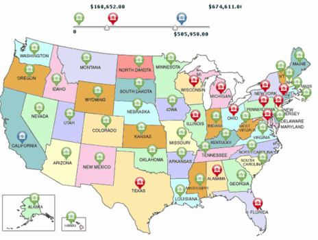
The Marker Mashup custom widget allows you to display a map with multiple regions. You can display map markers for the different regions, and display different markers for regions with low, medium, and high metric values. For example, you can display a map of the US, with map markers displayed for each state, as shown in the image below. You can display states with low profit data using green markers, states with medium profit data using red markers, and states with high profit with blue markers. You can use the slider at the top of the widget to define the values at which each range begins and ends.
Information to customize and use the Marker Mashup widget and other custom widgets is in the MicroStrategy Developer Library (MSDL), part of the MicroStrategy SDK product. With the MicroStrategy SDK, you can access additional MicroStrategy widgets, add third-party widgets, and create and use custom widgets. For more information and instructions, see the MSDL. For information on purchasing a MicroStrategy SDK license, contact your Account Executive.
Open the document in Design or Editable Mode.
Right-click the widget, then select Properties and Formatting. The Properties and Formatting dialog box opens.
From the left, select Widget.
Click the Widget
Properties icon  . The Marker Mashup Properties dialog box opens.
Modify the widget by selecting options in the Marker Mashup Properties dialog box. The table below provides a list of tasks you can perform, and steps to perform them.
Click OK to return to the Properties and Formatting dialog box.
Click OK to save changes and return to the document.
Click the name of the report to run it.
From the Tools menu, select Custom Visualizations. The Custom Visualizations Editor opens.
Click Visualization Properties. The Marker Mashup Properties dialog box opens.
Modify the widget by selecting options in the Marker Mashup Properties dialog box. The table below provides a list of tasks you can perform, and steps to perform them.
Click OK to return to the Custom Visualizations Editor.
Click OK to save changes and return to the report.
|
What to Format |
How to Format It |
|
Use static images as map markers in the widget. The image displayed for each metric value range is based on the value of the first metric on the columns of the underlying report or Grid/Graph. For more information on the data requirements for the Marker Mashup widget, see the MicroStrategy Developer Library (MSDL). Note: Sample images are located by default in:
|
|
|
Use colored bubbles as map markers in the widget. The color of each bubble marker is determined based on the value of the second metric on the rows of the underlying report or Grid/Graph. For more information on the data requirements for the Marker Mashup widget, see the MicroStrategy Developer Library (MSDL). |
|
|
Specify the file to use to provide the image map for the widget. For more information on the data requirements for the Marker Mashup widget, see the MicroStrategy Developer Library (MSDL). |
|
|
Specify the background color of the widget. |
|
|
Determine whether to override the bubble colors displayed in the widget. You can choose to override the colors used to display bubble markers in the widget by defining a threshold on the second metric on the columns of the underlying report or Grid/Graph, and specifying a fill color for the threshold. For examples, images, or steps to define a threshold, see the Basic Reporting Guide. For more information on the data requirements for the Marker Mashup widget, see the MicroStrategy Developer Library (MSDL). |
|
Related topics