Visual Insight allows you to quickly create a customized, interactive Visual Insight analysis that can be used to explore business data. You can use the data from an existing report or Intelligent Cube, perform manipulations on the data to customize the information that is included in the analysis, and add visual representations of the data (called visualizations) to the analysis to make the data easier to interpret. Analyses can be viewed in the Analysis Editor, Express Mode, or Flash Mode in Web, or on an iPad with MicroStrategy Mobile.
Visual Insight allows you to streamline the tasks required to create a polished analysis using the data. For example, you can:
Quickly add, rearrange, or remove attributes and metrics from a visualization in an analysis.
Create additional visualizations to display the data in multiple ways, then easily modify or switch between visualizations in an analysis.
Add filtering based on attributes and metrics to an analysis, to allow users to only display the information they are interested in.
Add thresholds to an analysis, to change the display of data based on the value of a metric.
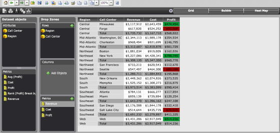
For example, in the image below, data in an analysis is displayed using a Grid visualization, which contains revenue, cost, and profit data for each Call Center in a Region. Total profit data is calculated and displayed for each region in the grid. Profit values of less than $100,000 are displayed using a red background, while values of greater than $400,000 are displayed in green.
You can easily drag and drop attributes and metrics to add them to the visualization, move objects to the columns or rows of the grid, or create a new metric from the metrics displayed in the grid.
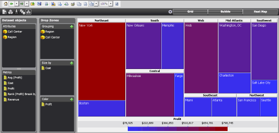
The image below shows a Heat Map visualization in the same analysis, which displays the data using colored rectangles of different sizes and colors depending on the cost and profit data for each Call Center. You can format the colors used to display the rectangles, delete rectangles from the display, and change how the size and position of the rectangles is calculated.
For steps to create an analysis, see Creating an analysis.
For more information on the types of visualizations available to be added to an analysis, see the appropriate topic below:
Grid visualization: You can display data in an interactive grid, allowing users to pivot, sort, move, drill, filter, and perform additional manipulations on data displayed in the grid.
Graph visualization: You can display the data in a graphical format and choose between a variety of different graphs, such as an area graph, line graph, or pie chart.
Graph Matrix visualization: You can display the data in a chart containing one graph for every combination of the data you specify, allowing users to examine the data for each combination individually.
Heat Map visualization: You can display the data as a combination of colored rectangles. Each rectangle represents an attribute element, and is colored and sized according to the value of metrics in the visualization, allowing users to quickly grasp the state and impact of a large number of variables at one time.
Google Map visualization: You can display the data as geographical locations on a map, then change the color, size, and display of markers based on the value of a metric, to allow users to quickly grasp relationships between different locations.
Once you create an analysis, it can be:
Viewed as an interactive analysis, allowing you to specify the data that appears, control the layout, formatting, grouping, and subtotaling of data, add, modify, and delete visualizations, and so on. Analysts can interact with the analysis you design to display different visualizations and filter, sort, and customize their view of the data. Analyses can be viewed in Web, or on an iPad with MicroStrategy Mobile. For steps to save an analysis, see Saving an analysis.
Converted to a Report Services document and saved. For steps, see Saving an analysis as a document.
Exported to a static PDF and sent to a printer. For steps, see Printing an analysis.
Sent in an email. For steps, see Sending an analysis in an email.
Sent to the History List, based on a set schedule. For steps, see Scheduling an analysis to be sent to the History List.
Related topics